
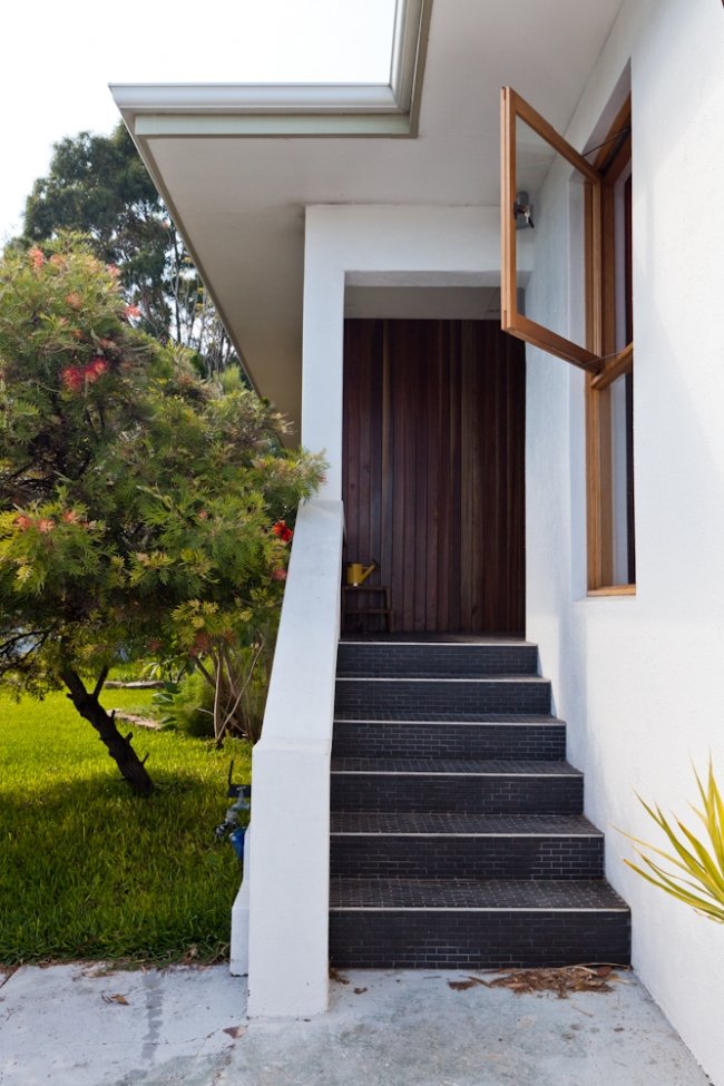
If you live in Perth, you will probably be familiar with our city’s old 1970s Italian and Greek mansions, predominantly dotting suburbs including Dianella, Morley, Karrinyup, Stirling, Fremantle and Mt Lawley. Perhaps as much a part of the Perth streetscape as the weatherboard worker’s cottage and the classic Federation home, many of these houses were built in the 70s and 80s and many still stand today, still proudly owned by their original owners and looking much the same as they might have when they were first built.
Others have been renovated – and this is rarely an easy feat. In typical Italian and Greek style, these houses were built to stand the test of time. Unfortunately not all of them are still ideally set up for how we generally like to live today. And when it comes to renovating and modernising them, they can be huge pains. But when done right? Totally worth it.
Photos by Heather Robbins of Red Images Fine Photography.
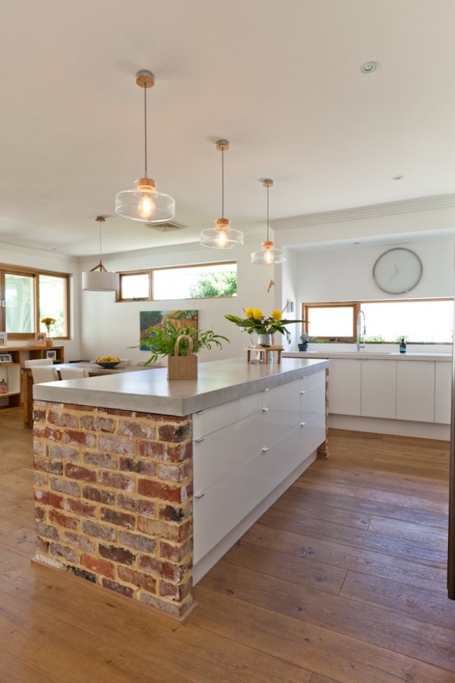
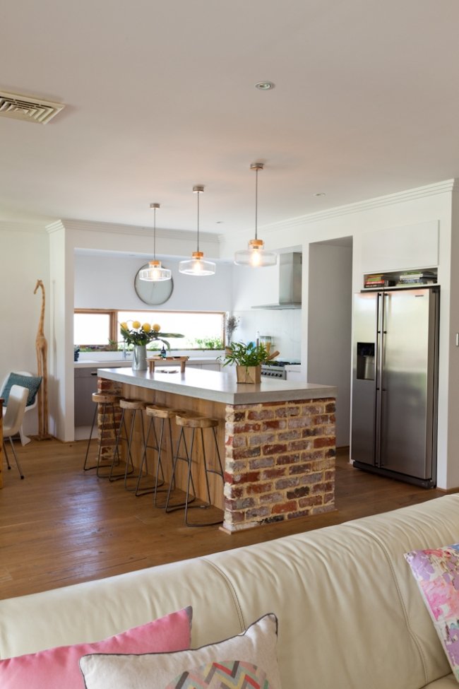
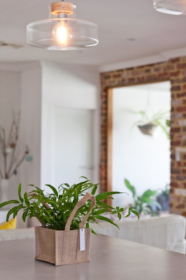
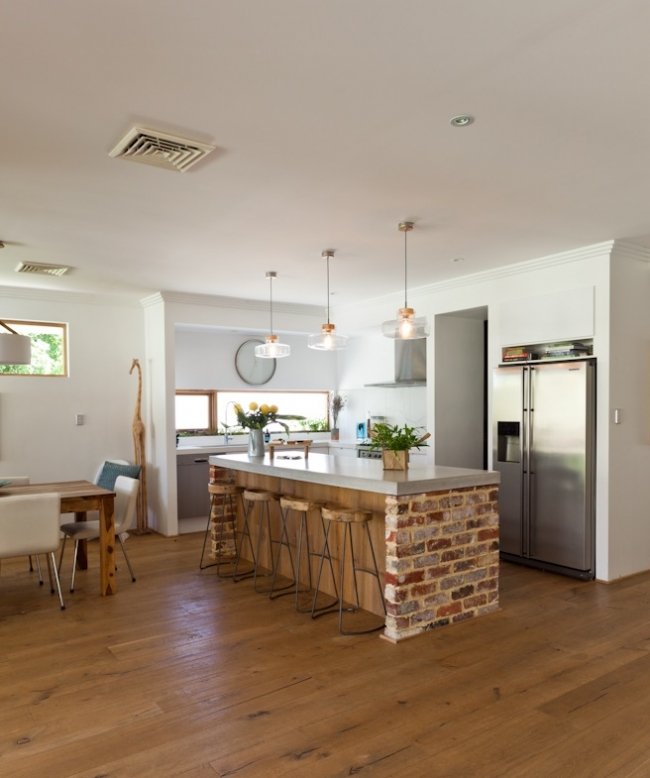
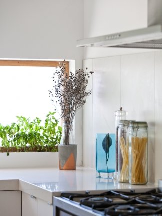
KITCHEN ISLAND: Studio Concrete in Fremantle did the chunky concrete benchtop to the kitchen island while the benchtop to the window area is Caesarstone. Here there is a built-in herb garden. Atop the island benchtop is a bag of greenery from Floral Army. The pendant lights are from Beacon Lighting. Photography by Heather Robbins of Red Images Fine Photography.
Photos by Heather Robbins of Red Images Fine Photography.
Quite often dark and oppressive inside, these solid older houses stand proudly, with features that might traditionally include abundant granite or marble, concrete pillars, shag pile carpeting, sweeping staircases, endless arches, stone lions and gardens encased in concrete – and perhaps fountains and rose bushes. These guys were built to last – and the idea of renovating them is quite often so difficult that many people choose to bulldoze them over and start again.
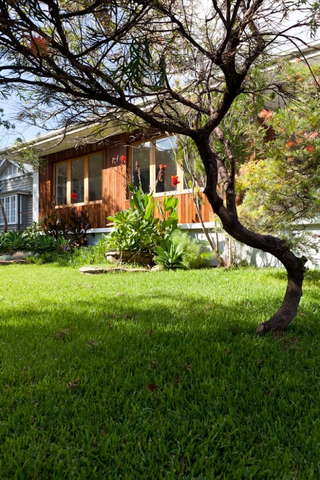
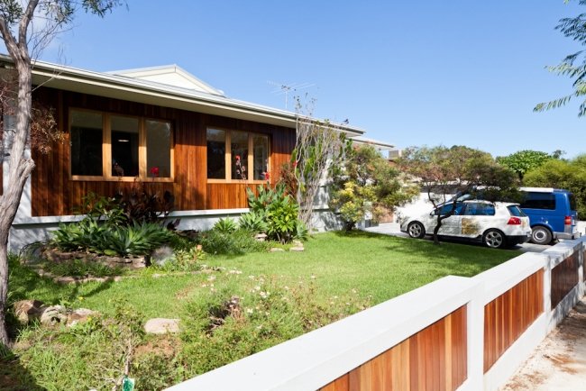
But that was not the case with Breadbox Marketing owner Emma Potter and her husband Martin, who in 2012 bought this Italian mansion, thought to have been built in 1973, and began a full renovation and extension - while living in it with their two little kids. “It was a typical old Italian mansion – double brick and then some!” says Emma. “Built to last and a mission to renovate in lots of ways, but also sacrilege to knock down because of that very reason. But it was ugly! Everything was brown and olive green. The floors were tiled with orange sandstone with a slate look. There was a jarrah bar and the kitchen was jarrah doors and benches. It didn’t have a pretty frontage. It was a heavy and dark house throughout. We were determined to renovate even though it was a very ugly, heavy home. We moved walls in and restructured almost every room.”
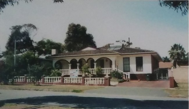
BEFORE. An old photo of the house in its former glory!
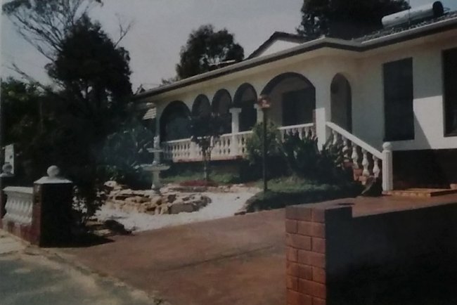
BEFORE
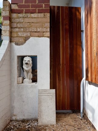
A FELINE MEMENTO: One of the Italian mansion's original stone lions still stands, a memory of what the house used to look like.
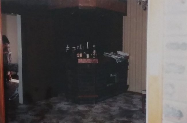
BEFORE: The house's interiors were dark and dated.
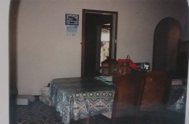
BEFORE
Before moving, Emma and Martin had lived in a lovely classic weatherboard cottage just two doors down, but they wanted a bigger garden for their kids, Cooper, now 6, and Daisy, now 4, to have space to run around, and this block was a whopping 938sqm – which also gave room for a pool. “I didn’t love the house, but we loved the area and school and didn’t want to move far,” says Emma. “Our street is friendly, rustic and down-to-earth and suited our personality. The house didn’t! But we hoped we could change that." Emma says they bought it for the backyard. "It is a full block and we wanted the space for the kids and dog to run. We are outdoors people and we wanted that even at home.”
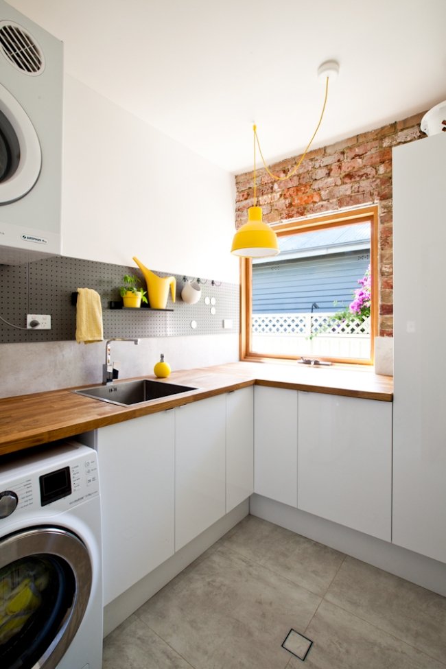
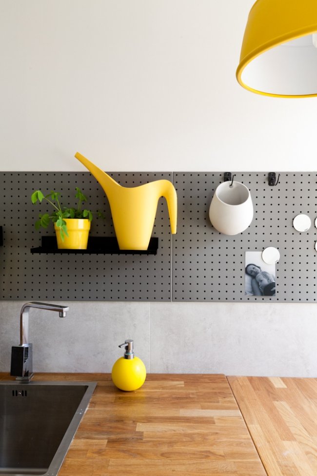
LOVE THIS LAUNDRY: I really liked the Potters’ laundry, where a piece of painted pegboard adds as a useful splashback. The plaster was painstakingly removed from the original brick to create an exposed brick feature wall. Photos by Heather Robbins of Red Images Fine Photography.
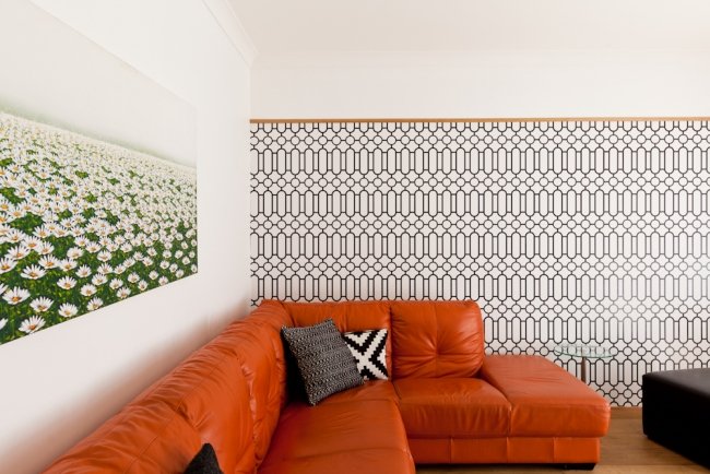
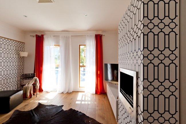
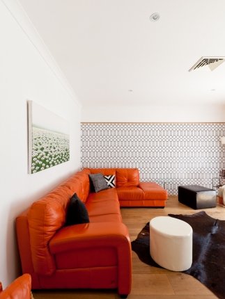
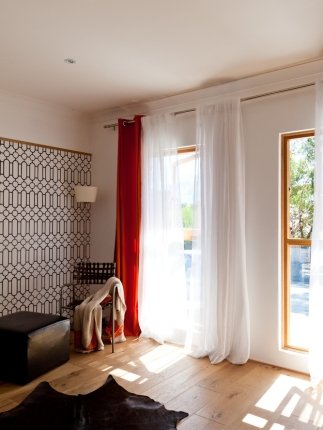
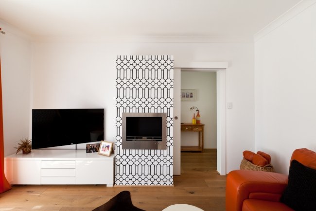
THE FRONT LOUNGE: The front lounge has a funky vibe that was specially designed to pay homage to the home’s roots as a 1970s abode. Photos by Heather Robbins of Red Images Fine Photography.
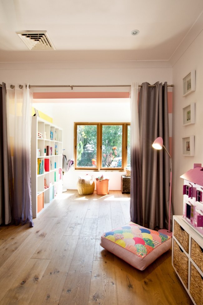
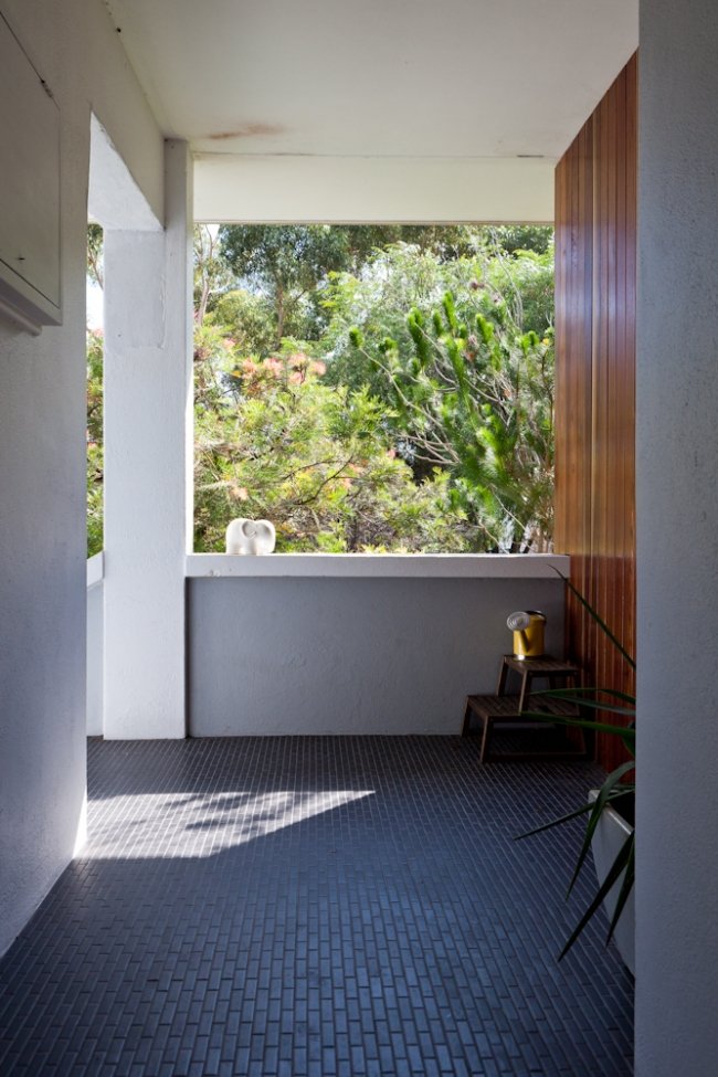
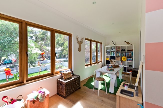
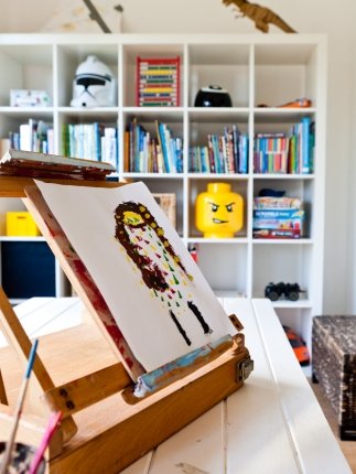
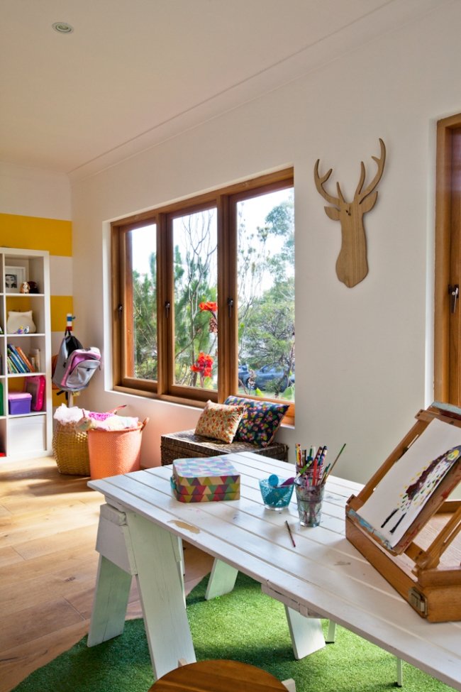
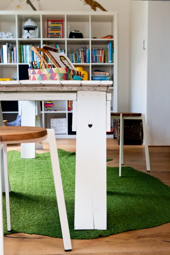
VERANDA TURNED PLAYROOM: The front veranda, formerly typically Italian style with concrete pillars, was enclosed to become a beautiful playroom for the kids. Emma says the idea was to give them a true space of their own – where they could draw and play if they got up early in the morning, without waking up Mum and Dad! The kids’ drawing desk is an upcycled door. Photography by Heather Robbins of Red Images Fine Photography.
Style-wise, for their own place, the Potters wanted a house that ‘didn’t take itself too seriously.’ “We wanted something down to earth, warm and inviting, nothing too precious that we were scared of damaging,” says Emma. “We wanted it to be light, spacious and easy to live in. Although we love architecture, we wanted comfort and warmth for our family rather than architectural angles and edgy design.”
Emma says the finished house suits a rustic yet minimal feel. “I like lots of white, but I also love bold bursts of colour and wood. I love things that get better with age, upcycling and things that are imperfect and have lots of character.”
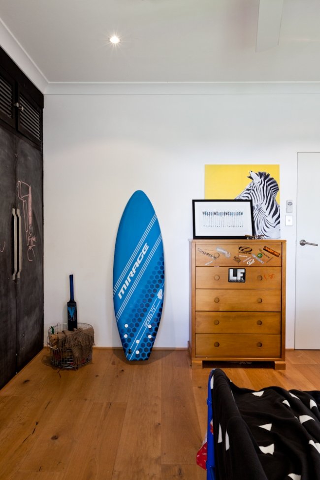
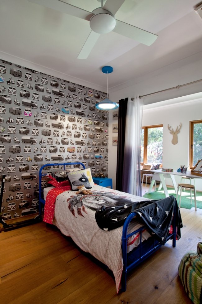
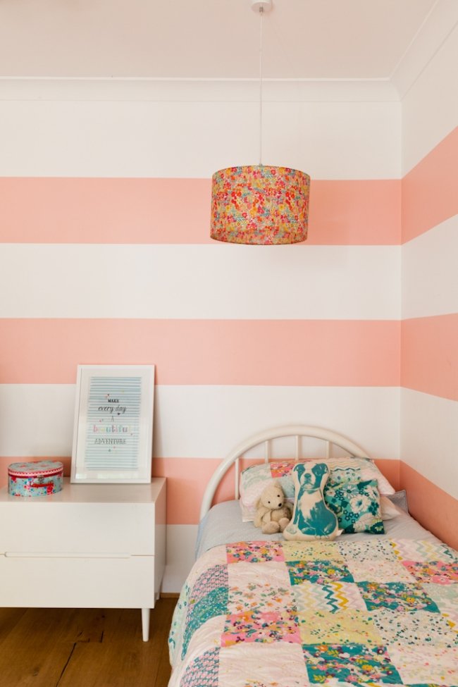
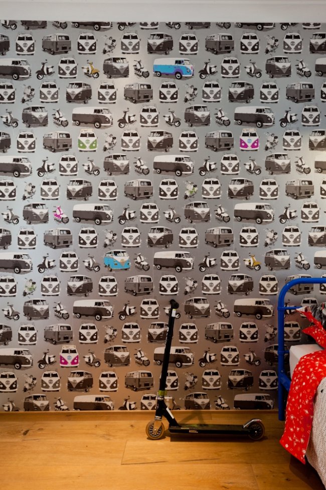
COOPER'S BEDROOM: Six-year-old Cooper's room features a zebra picture from Kmart.... I have the same one! Photos by Heather Robbins of Red Images Fine Photography.
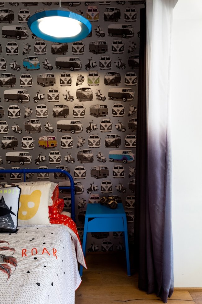
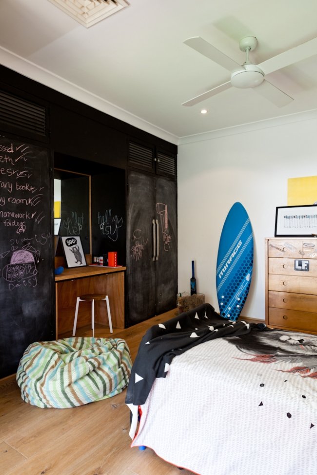
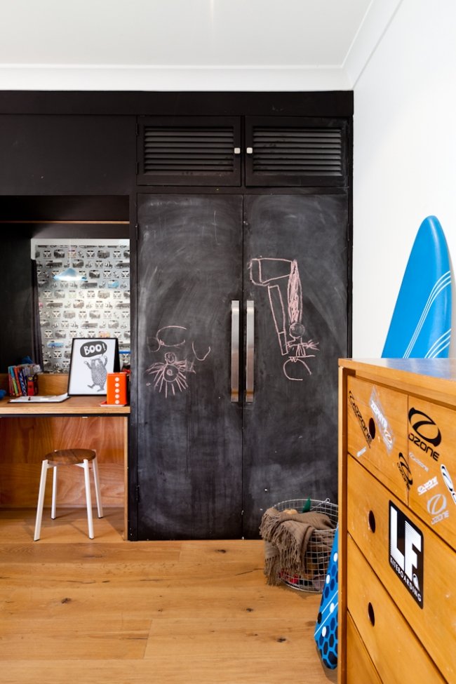
COOPER'S ROOM: Where Emma and Martin could, they saved money by reusing existing things. In Cooper's room, the existing 70s wardrobe was given a lick of chalkboard paint and a plywood desk top added to take it from dated to trendy.
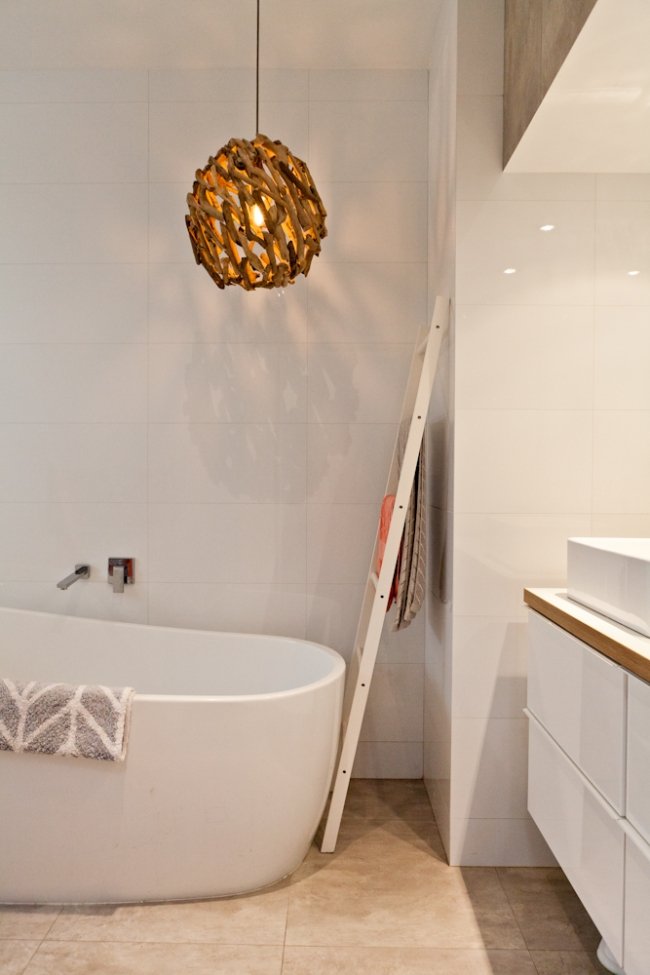
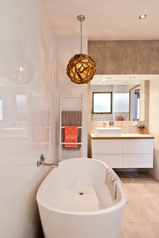
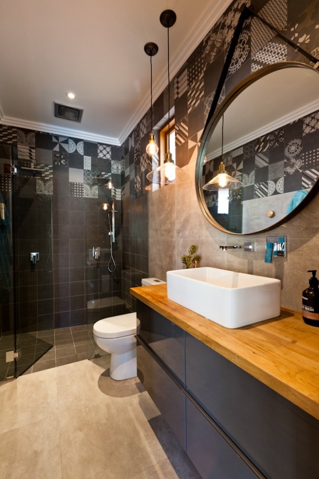
A BEAUTIFUL BATHROOM: Emma made the driftwood light in the main bathroom. Photos by Heather Robbins of Red Images Fine Photography.
WHITE WALLS: Emma and Martin painted the house in Dulux Lexicon Quarter. "The quarter is important!" says Emma. "Full Lexicon can look grey and I’ve heard of it looking blue (and very cold). I believe it is just white with a very tiny touch of black. This takes the creamy tone out of the paint and stops it yellowing over time. It gives a very bright white appearance. But you do have to be careful as it can appear very cool if not balanced." Photography by Heather Robbins of Red Images Fine Photography.
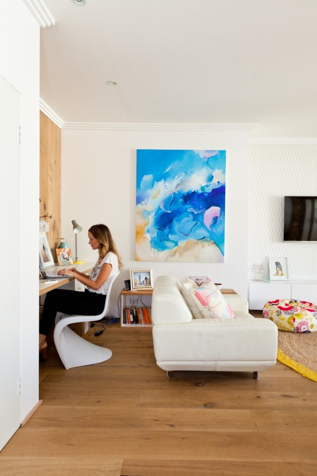
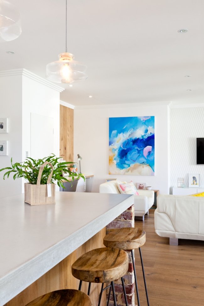
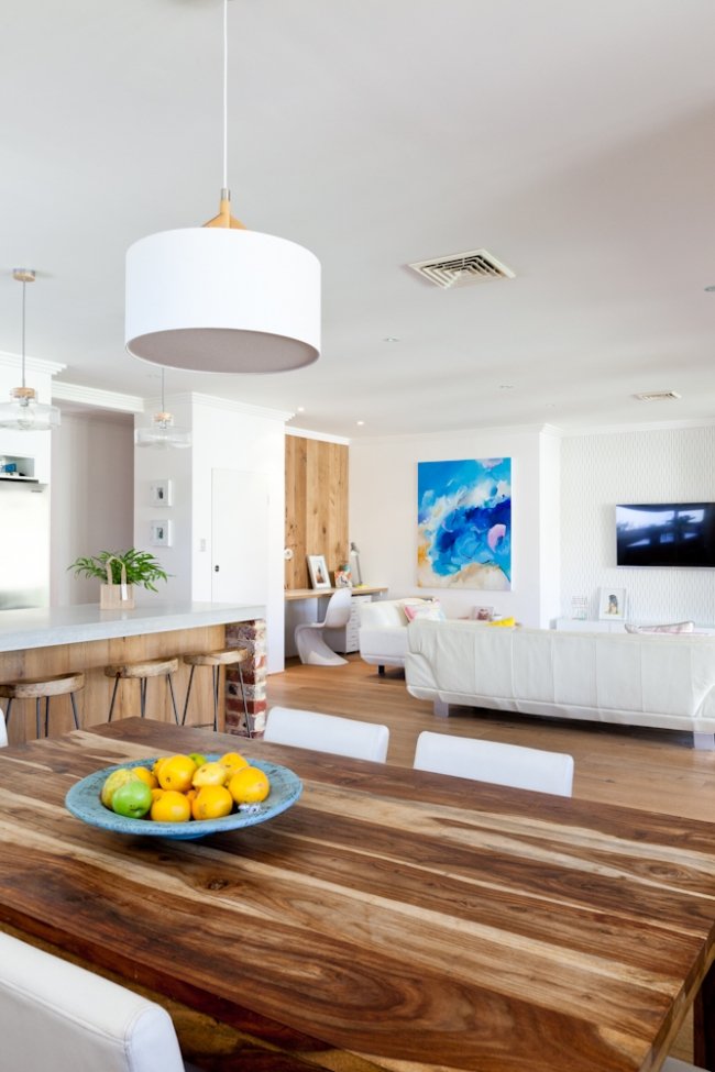
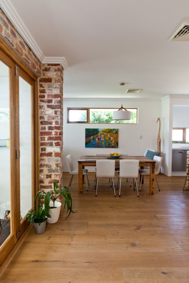
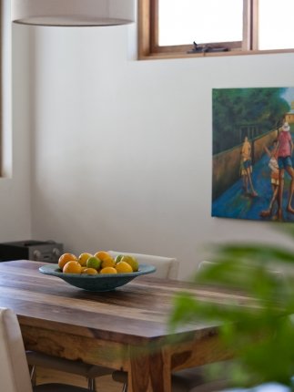
THE LIVING ROOM: By her office nook, Emma has a painting by up-and-coming artist and personal friend Britt Dunbar, who painted this custom piece for her over the summer. “It captures our love for the ocean and the great outdoors. People always comment and praise it. It is a wonderful feature.” Photos by Heather Robbins of Red Images Fine Photography.
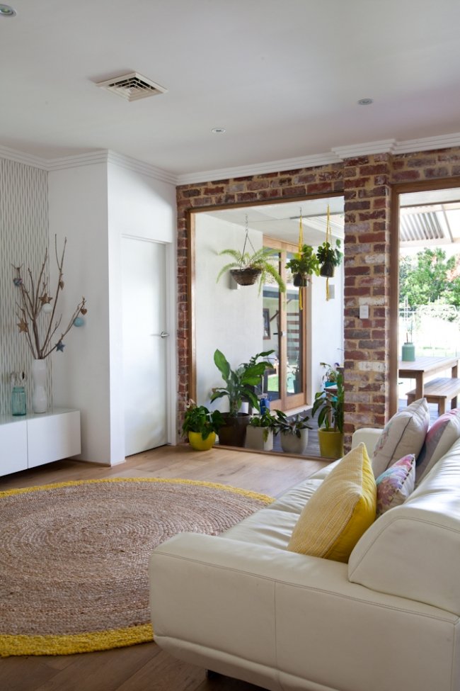
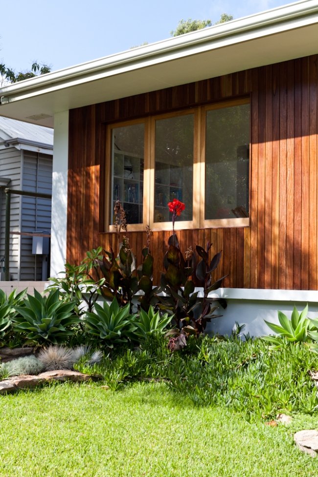
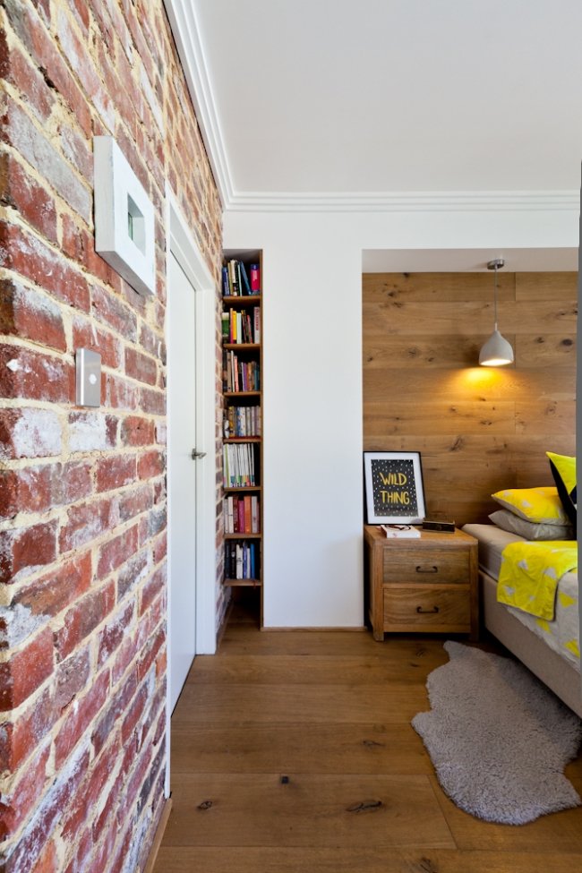
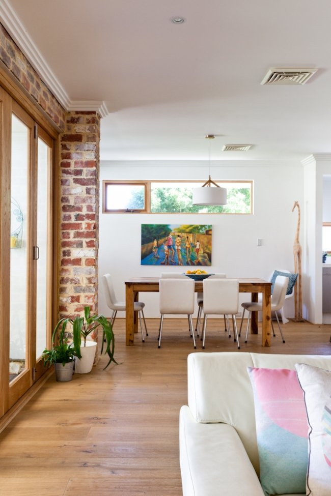
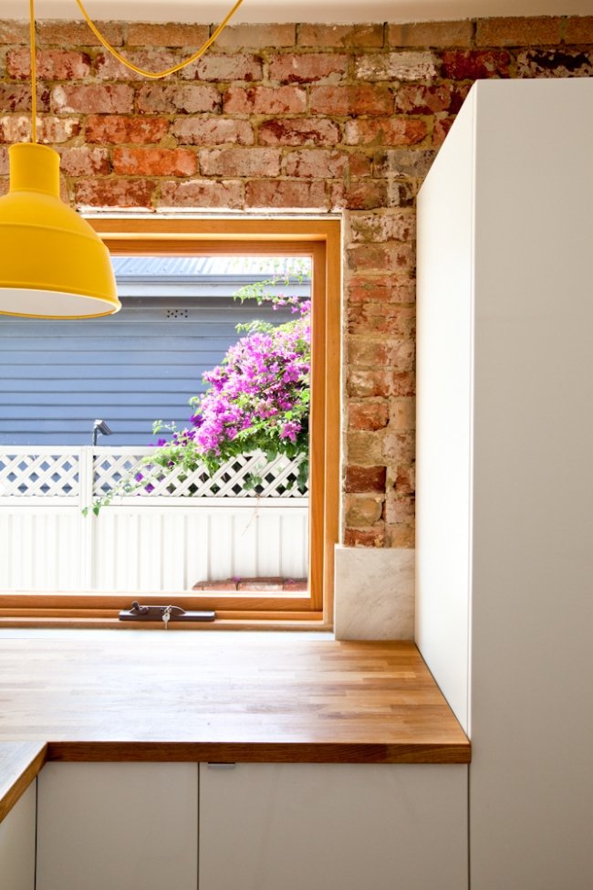
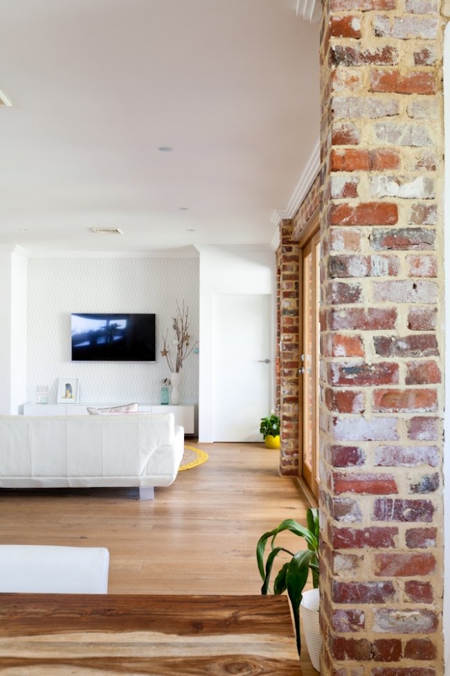
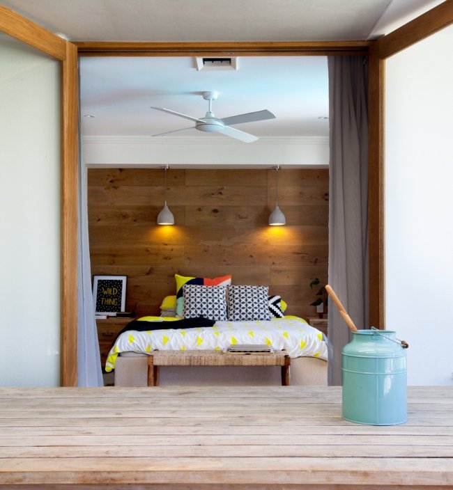
EXPOSED BRICK: Exposed brick is a huge feature in this home, adding warmth and character. "The red brick in the laundry is original, and the red brick wall that runs through the living room and into the bedroom WAS original but after the plaster came off it wasn’t structurally sound, so we had to knock it down and rebuild it," says Emma. "The bricks came from a salvage yard, and we tried to match the tone, style and era. We found it crazy that this beautiful red brick was hidden behind the brown bricks – we suspected earlier renovation works but can't be sure!"
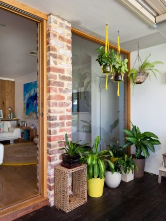
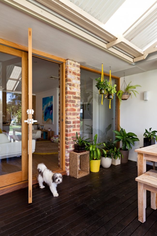
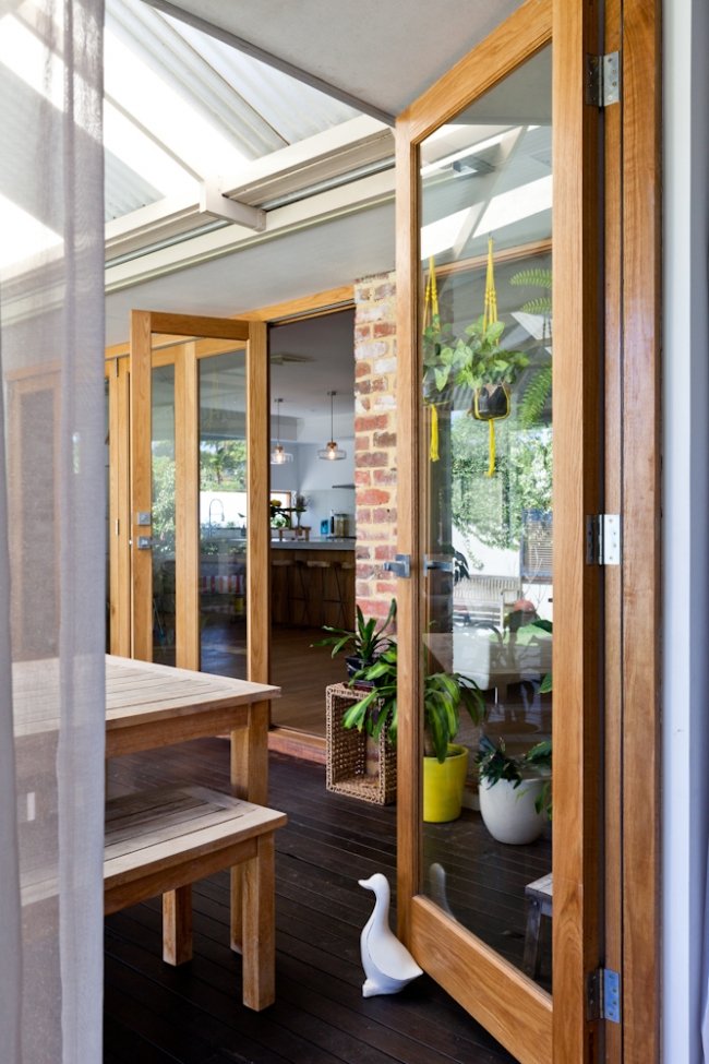
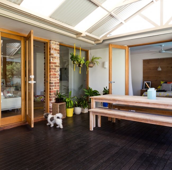
ABOVE LEFT: Hanging plants by the veranda. The family love to eat outdoors here. “We love to entertain family and friends,” says Emma. “The house is very open and child friendly making it perfect for entertaining small to large groups. We also rent out our granny flat to international travelers and we love meeting new people. It makes life interesting and always new.” ABOVE RIGHT: Emma at her home office desk. Photos by Heather Robbins of Red Images Fine Photography.
WHITE WALLS: Emma and Martin painted the house in Dulux Lexicon Quarter. "The quarter is important!" says Emma. "Full Lexicon can look grey and I’ve heard of it looking blue (and very cold). I believe it is just white with a very tiny touch of black. This takes the creamy tone out of the paint and stops it yellowing over time. It gives a very bright white appearance. But you do have to be careful as it can appear very cool if not balanced." Photography by Heather Robbins of Red Images Fine Photography.
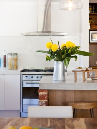
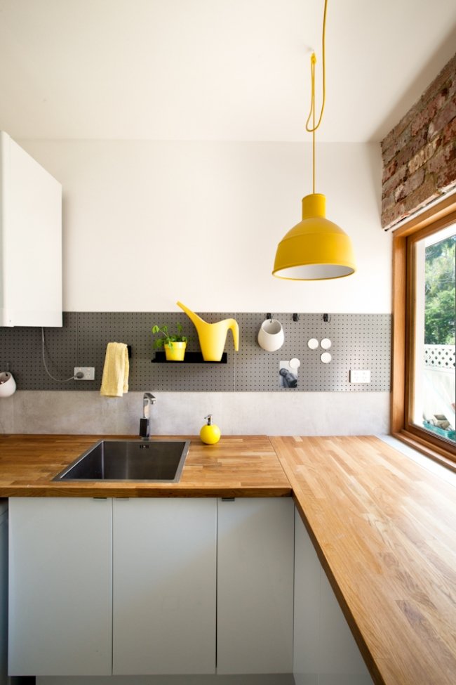
ABOVE: The kitchen stools were from Freedom.
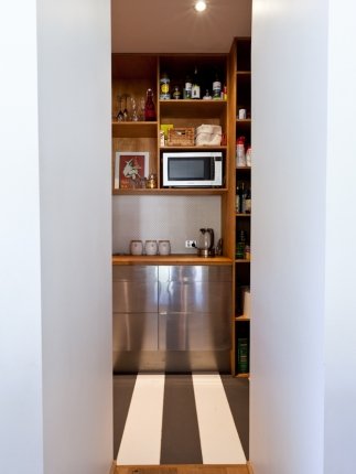
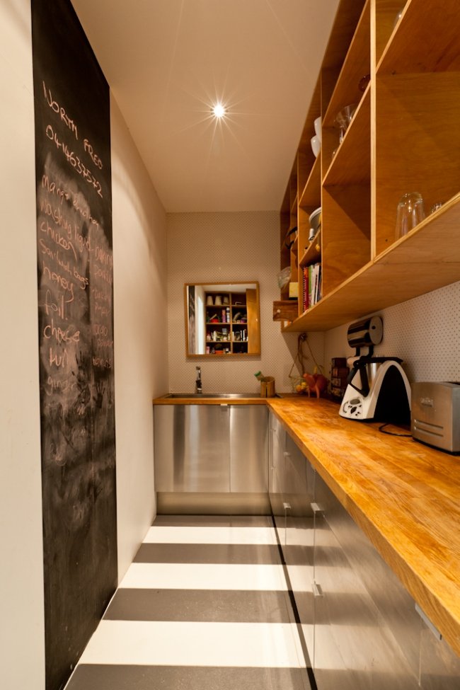
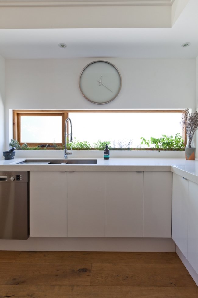
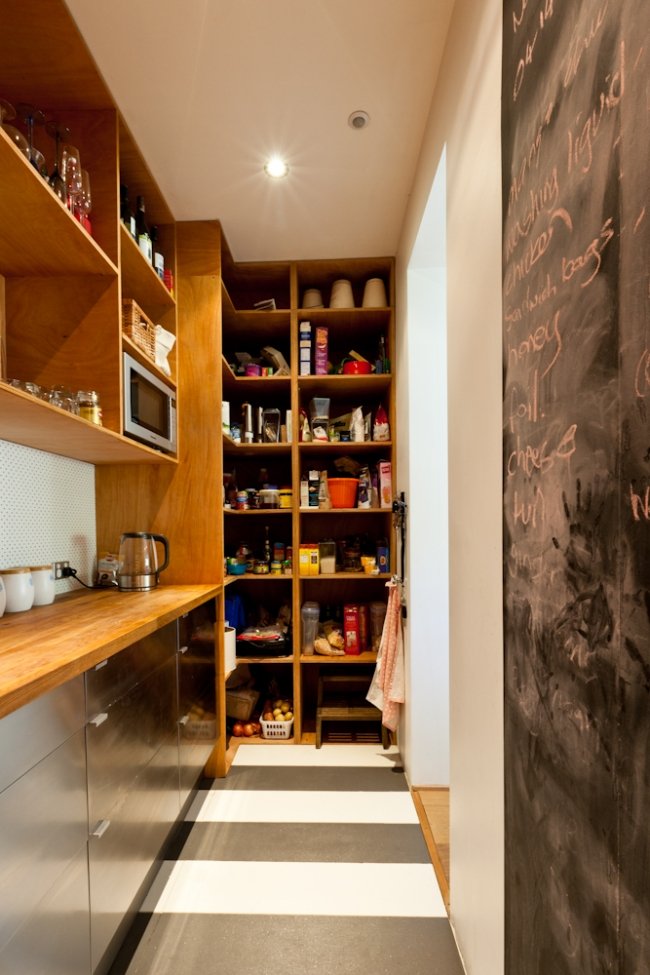
THE SCULLERY: “The scullery is my favourite room,” says Emma. “It feels like being in a café and I can leave it messy!”
She now has a wealth of tips learned first-hand. Because parts of the original, solid Italian mansion were so difficult or costly to change or remove, the Potters ended up designing around them. Emma says at first this bugged her, but now she says it is actually what makes their house unique. “Some of the things I really didn’t want have ended up becoming my fave things,” she says. “Like the brick pillar that protrudes into the lounge. It adds so much character and interest. I think I’d advise other future renovators - don’t get too caught up on perfection, as it doesn’t change how you feel in the space. And you don’t need to spend a lot of money often – my favourite features are certainly not the most expensive ones.” Maya x

HOME LOWDOWN

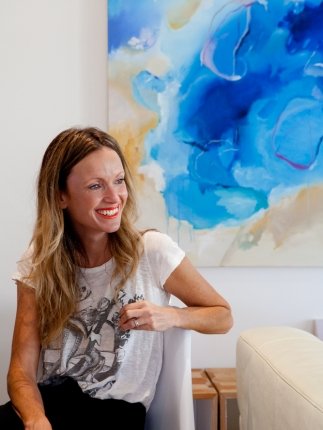
Emma at home.
THE OWNERS
Breadbox Marketing owner Emma Potter, her husband Martin, their son Cooper, 6, daughter Daisy, 4, and dog Meg, 3
THEIR HOME
A fully renovated and extended former 1970s Italian mansion
LOCATION
Fremantle, Western Australia
PURCHASED
2012
THE FLOORPLAN DESIGNER
Adrian Fratelle of Ecohabit worked with the Potters on the design
THE INTERIOR DESIGNER
Owner Emma Potter has now launched her own design company, Breadbox Interiors. You can check out their portfolio here.
FEATURES
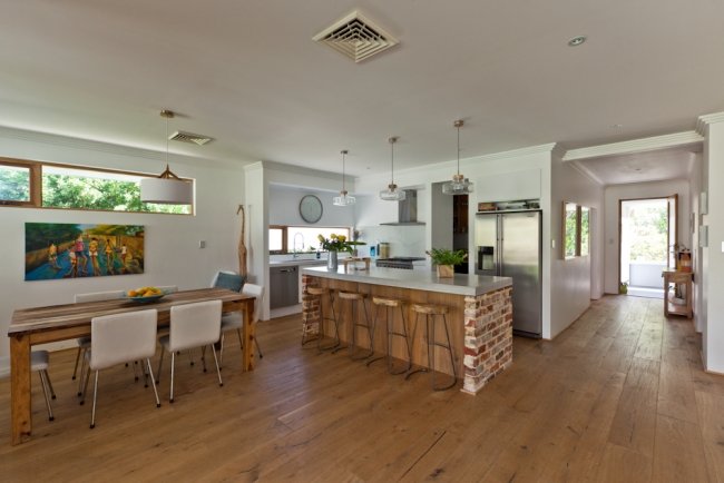
Four bedrooms, two bathrooms, open-plan kitchen, living and dining, front veranda, deck, pool, self-contained studio apartment in garden (which is available for let on AirBnB)
PHOTOGRAPHY
Heather Robbins of Red Images Fine Photography


