One of the most common problems I think people have when renovating and decorating their homes is choosing the right white paint. We love our white walls in Australia, and for good reason – white walls are versatile, they feel fresh, light and airy, they work with all kinds of décor and they can make a room feel bigger, brighter and more uplifting.
But white paint isn’t ‘just white’ anymore. These days there are literally hundreds of white paints on the market, and choosing one can seem a daunting task. On top of that, choose the ‘wrong’ white paint and the perfectly bright, airy room you envisioned can have something that just feels ‘off’ about it – the walls could look daggy, yellowed, discoloured or even have a pinky undertone, and the room you envisioned as feeling bright and airy could actually look darker or gloomy!

But don’t let that deter you – you just need to figure out which is the right white for your home. And this post is going to help you do just that!
Dulux, a paint we use a lot and love, has numerous ambassadors who are some of Australia’s biggest names in design, including Lucy Feagins, editor at The Design Files, Julia Green of Greenhouse Interiors, Bonnie Hindmarsh and Lana Taylor from Three Birds Renovations, and Sara Chamberlain and Amy Chamberlain-Primrose of The Real Estate Stylist.
They are all women whose work in the design fields I love, and I’m so excited to share their expert tips for choosing the right white paint for your home below. (And if you have any other white paint questions, please feel free to leave in the comments and I’ll see if I can get an answer for you).


HOW TO CHOOSE THE RIGHT WHITE PAINT
Understanding cool whites versus warm whites.
The first step to learning about what whites work in a space is understand the difference between cool whites and warm whites. Basically, each paint has a warm or cool undertone. Warm whites tend to have a hint of a red, yellow, brown or pink base to them. Cool white paints have a blue, grey, blue-pink or slight black undertone.

To someone like me – someone who is not a natural with paint colour – it’s not always easy to readily pick a white that is warm and a white that is cool. But these pictures should show you the difference. The first is a warmer white (Dulux Hog Bristle), underneath is a cooler white (Lexicon Quarter).


Different homes and rooms tend to suit warm or cool whites. Generally speaking, cool whites are best suited to contemporary, modern, spacious and light-filled homes as well as open-plan living spaces.
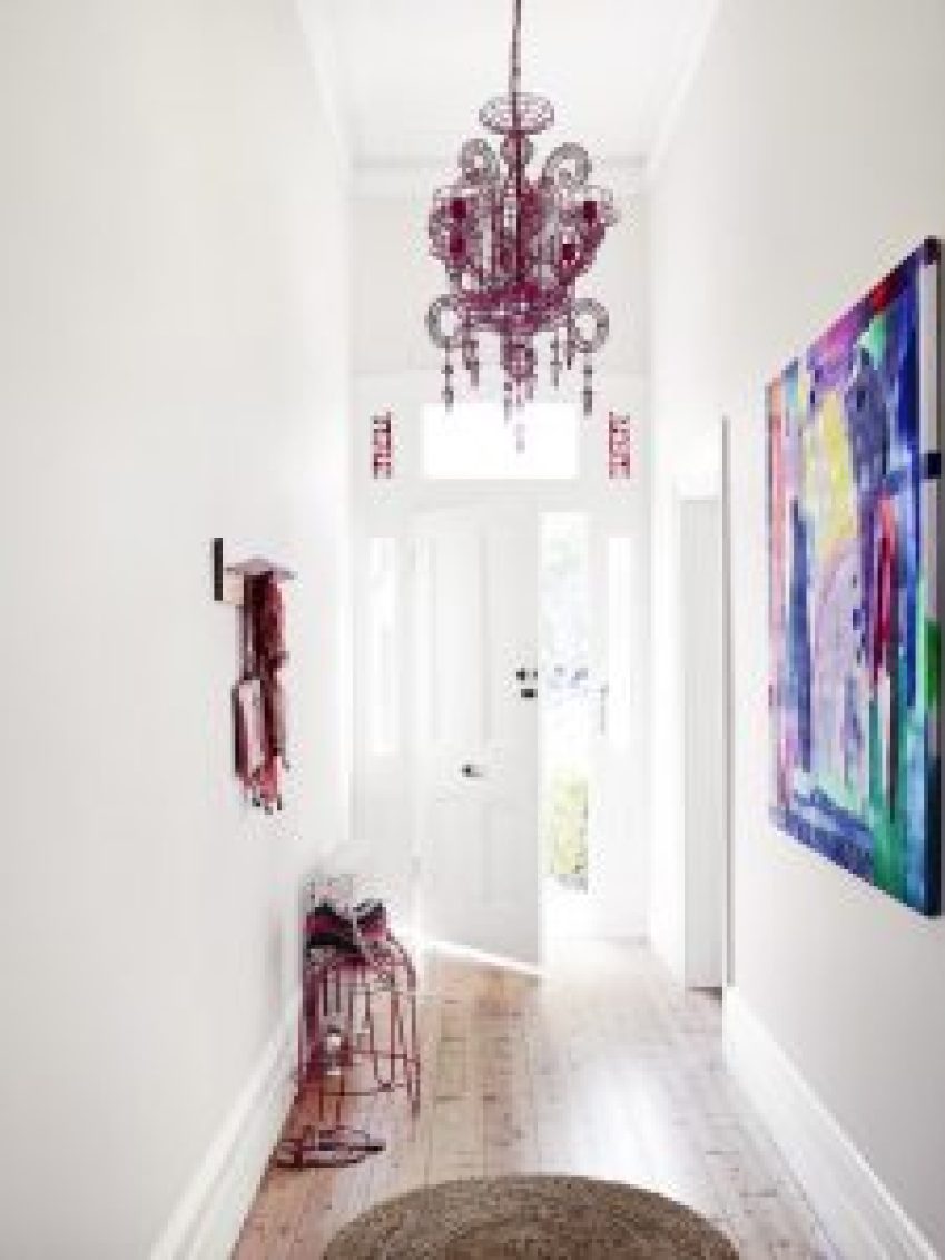
On the other hand, warmer whites tend to better fit older or character homes, interiors that don’t receive as much natural light, and generally tend to work better for smaller, more enclosed rooms (like entry foyers, hallways, bedrooms, studies and formal lounges).
Know that the amount of natural light your room gets plays a huge role.
The next step to choosing the right white paint is to think about how much natural light your room gets – and also from which orientation the natural light is coming from. Ugh! Don’t throw up your hands in despair because it seems too hard. We can work it all out.
So – orientation. Is the natural light coming from the east, in the mornings only? Is it a small, darker room that doesn’t get a lot of natural light? You may want to select a slightly warmer white that will visually warm the room up a little bit in the late afternoons. Try a warmer white like Dulux Antique White or Whisper White to make the room appear warmer. In a room that doesn’t get much natural light, it’s usually best to avoid cooler whites as they can make the room feel gloomy or cold.

Or do you have a north-facing room that receives great natural light all day long? If your room gets a lot of natural light, you may want to skip the creamier, warmer whites, as the sunlight will make it appear more yellow and might make it look a little daggy. Instead, slightly cooler whites would usually work better (as can pale greys) as the sunlight will make the room appear warm (it counteracts the ‘coolness’ in the paint’s tone).

The white that works in your friend’s house might not be the same white that will work in your house – they can look completely different. (Even your light globes – which often come in cool and warm options – can affect the look of the white you have chosen! If you have chosen a brilliant white, a cool globe could make your room feel very clinical and lab-like. A warm globe might be a better option). Light plays a MASSIVE role in the way a white paint will appear on your walls, and this is why the next step in choosing the right white is so important…
Get your sample pots… and go nuts.
My tip here is don’t shy away from doing just one sample swatch. Try out a swatch next to a window at eye-level, on a wall that doesn’t get as much light, and paint another one closer to the floor. Dark, strong-coloured flooring like jarrah or honey-toned timbers like blackbutt can actually bounce ‘colour’ back onto the wall and affect the way the paint looks by making it appear pink or yellow (or even green). You can get sample pots from your local hardware or paint store or order them online like through Dulux’s site.
Look at your swatches in different times of day and compare how the swatches looks with your furniture, art, flooring, textiles, cabinets, night-time lighting.
Paint brochures tend to only have the tiniest samples of paint in them – skip trying to base your final decision from these brochures. Always, always get a sample pot of the two or three whites you have in mind and trial a generous test patch – or three, or four, or five! The bigger your space (particularly if it’s an open-plan living space) the more sample swatches you should do. Trust me, this is coming from someone who has decided not to swatch-test and sorely regretted it later after I’ve had to re-paint an entire room! (Our bedroom makeover debacle).

CHOOSING WHITE PAINT – COMMONLY ASKED QUESTIONS
What white paint works with jarrah floors?
Jarrah floors are lovely, but when glossy they tend to ‘bounce’ a reddish light onto walls. For this reason (and because jarrah floors are usually found in older homes) they can work well with slightly warmer whites, but avoid those with a pinky undertone. Try Dulux White on White or Natural White.

What is a good white for a character home? I have an old character home with a lot of heritage details and have styled it in a mostly classic way.
“Whisper White is warm, welcoming and has substance, and period properties – Victorian and Edwardian homes – benefit from this white given its depth,” advises Lucy. “In a space that doesn’t get much bright sunlight, Dulux Whisper White can really lift the room.”
Other warm whites could also work, says Julia of Greenhouse Interiors. “Hog Bristle® Quarter is a beautiful warm white that has the slightest ‘biscuit’ undertone – it has always been my go-to when creating cozy spaces,” she says. “I have seen this colour work beautifully in heritage homes, but equally in spacious lofts to avoid austerity.”
Dulux Antique White USA also works very well with many Australian character and modernist homes – it has a classic appearance that ties in well to character homes, which often have features like dark hallways, big rooms lit only by comparatively small windows, and are oriented to make the most of natural light in general. Homes like this often benefit visually from creamier, warmer whites.

What white works best with a Scandinavian-style interior and light or white-washed floors?
Try samples of Dulux Vivid White, Dulux China White, which is a darker white with a greenish undertone that makes it really neutral, or Dulux Natural White. “Natural White™ is a warm white and its versatility spans across new and old properties, contemporary homes, as well as traditional, says Sara Chamberlain of The Real Estate Stylist. “It is an excellent choice if you are giving your home a facelift before sale as it is easy to work with when styling with fresh plants and light coloured furniture. It looks great with contrasting trims in a light clean white such as Dulux Vivid White. I also love Dulux Stowe White, a great white for more traditional homes, as it works well with traditional colour schemes and has a lovely warmth to it.” You can get most white paints in varying degrees of strength – ask for half-strength or quarter-strength if the full strength you try is too strong for your space.


What is a good white for a small, darker bedroom or study that doesn’t get a lot of natural light?
Try a sample of Dulux Vivid White. This is considered the ‘purest’ white in that it tends to look neither warm or cool – it’s a true bright white and perfect for helping to brighten rooms and spaces that don’t receive a ton of natural light. “For me, I don’t like a white to throw too much yellow or too much blue – so Dulux Vivid White™ is perfect as it sits in the middle,” says Bonnie Hindmarsh of Three Birds Renovations. “It is the purest white you can get and is fresh and crisp.”
My interior designer friend Nelly Reffet advised me to paint my old east-facing craft room (you can see that makeover here) from Dulux Antique White to Dulux Vivid White and I’m not going to lie, back then I was a total sceptic that the right white could really make all that much difference. Like, really? Why make the effort to repaint a room that already technically had white walls in perfectly good nick? Well, it made the BIGGEST difference to that room, and instantly made it feel brighter, lighter and more modern. I loved it. The right white can transform the feel of a room and will make the things you own and have styled with – your furniture, art, accessories – look their best.

What white paint goes with concrete or stone floors?
“Dulux White on White™ is a cooler-toned white that is clean and energising, suited to modern homes with timber or concrete flooring, as well as hard surface areas like the kitchen and bathroom,” says Bonnie Hindmarsh of Three Birds Renovations.

Another one to try is Dulux Antique White U.S.A.®, advises Julia Green of Greenhouse Interiors. “Given its warmth, it looks great with cooler substrates, such as natural stone and concrete. It warms the space up to avoid it looking ‘lab-like’! It also works will all colours so you are not limited at all.”

Our house has blackbutt flooring – what white paint will work best?
Try Dulux Natural White or Antique White to complement the gorgeous tones in blackbutt floorboards. Dulux Whisper White is another good white to team with natural materials and tones – we picked this for my sister’s unit, which has oak-coloured vinyl floors. (This is decidedly NOT my sister’s unit!)

I have a lot of brightly coloured and eclectic art work. What white paint would work to show it off?
Lucy says Dulux Lexicon® Quarter is a versatile white that has a slightly blueish undertone and is ideal as a backdrop for a quirky art collection. “It is crisp, clean and bright,” she says. “I have used the colour in my home, in my art gallery and in my workspace. I find that if your taste in furnishings, homewares and art is colourful and eclectic, then a crisp bright white such as Dulux Lexicon® Quarter is a great foundation to build that sort of interior.”

What is a good white paint for a really modern or industrial-style interior?
Modern homes tend to suit cooler whites – think Dulux Vivid White, White on White, Lexicon® and Lexicon Quarter. Amy Chamberlain-Primrose from The Real Estate Stylist says Lexicon® was her pick for most modern and industrial-style properties. “It is a bold white and pairs brilliantly with timber flooring, exposed brick and polished concrete. It is a perfect shade for displaying your artwork collection or bouncing around lots of natural sunlight.”

What white will make a room seem cosier?
Try the warmer whites – like Natural White or Antique White. I’m going to throw you a curveball here and even suggest looking at light greys! Sometimes a warm, light grey will work even better than a white – take a look at this beautiful bedroom below painted in Dulux Unforgettable. (But that’s a whole other blog post for a different day!)

What is a good pick for an ‘all-purpose’ white that would work in a character home with a contemporary extension out the back?
“Dulux Antique White U.S.A.® is my hero of all whites as it is fresh and crisp without being austere and clinical, and tends to work in most spaces despite the varied conditions,” says Julia Green of Greenhouse Interiors. “A total all-rounder that never disappoints! I love it for its versatility. It translates across all home styles with ease. It is a welcoming white that loves heritage homes, but can work well in contemporary homes also. In bright north-facing sun it can throw off the warmer ‘yellow’ hues, making the finish look a little creamier, so this should be considered when selecting it. If you have low ceilings it would be a good idea to paint the walls and ceiling the same color, so it opens the space and takes away attention from the low ceilings.”

What whites suit a big contemporary or modern open-plan living space?
Generally speaking, cooler whites tend to suit an open-plan living area. Open-plan living spaces usually tend to receive a lot of natural light, they are bigger rooms, and in Australia they generally tend to lean towards looking more contemporary (over very traditional).
Try Dulux Vivid White, advises Bonnie Hindmarsh of Three Birds Renovations. “For me, I don’t like a white to throw too much yellow or too much blue – so Dulux Vivid White™ is perfect as it sits in the middle. It is the purest white you can get.”
Bonnie says she also likes Dulux White on White™ for modern spaces, such as a contemporary kitchen or open-plan living. “To add warmth and texture to the space, style with timbers, blush-toned furniture, flowers and greenery. Given it is a clean colour, keep the styling minimalist. White on White™ is suited to modern homes with timber or concrete flooring; as well as hard surface areas like the kitchen and bathroom.”


How should I be painting door frames and skirtings?
I personally love it when door frames, skirtings and doors are painted in a lovely bright high-gloss white such as Dulux Vivid White. I think it shows them off to their best and just has a way of making your interiors look just that little bit more expensive and pulled-together.
Enamel-based paints have the highest gloss levels and look beautiful. However, enamel paints tend to gradually discolour or yellow slightly with age (and tend to smell strongly as they cure) so I now use only water-based paints on trims, doors and skirtings in our home. Choose one with a glossy finish and it will still give you a lovely glossy contrast against matte-painted walls.
Have you ever struggled to choose a white paint and why? What did you end up picking? Maya x

Stunning post Maya!!! How is Julia Green’s home??? Just exquisite
I had no idea, when I switched from ‘colour’ to white in my house, how I would love it. I fell in love with Scandinavian interiors (not just the muted colours but also the lean towards uncluttered + simple) and I found out that coming to my almost completely white house at the end of each day makes me happier and that I can unwind (from my very stressful and hectic job) better and faster. Although I like the maximalist boho style because it’s such a feast for eyes, I cannot live in it. I have a friend who is as boho as they get and her house if a riot of colour and knicknacks, I feel like I have to leave after 2 hours because the room is closing in on me or something. So I suspect I will remain faithful to white for a very long time. I do need a recommendation though for my bedroom – currently painted off white (Benjamin Moore’s Feather Down) but since the room faces north it never gets direct sun and it always looks dark (there are trees nearby). I need to switch to something lighter but I want to keep my curtains (which are oatmeal colour). Oh, and the next best thing after white painted walls is a white dog!!! A total must!
I have a west facing townhouse and have no idea which white to choose! Downstairs is entirely open plan with tan coloured wooden flooring, upstairs are three bedrooms and two bathrooms. The whole house has been painted in an odd light custard colour (it was part of an early 2000’s development). One bedroom faces full west, one bedroom faces full east, and one bedroom faces north.
It would be easiest if one paint colour could be applied in all these areas, but I’m not sure where to start!
I have a question regarding a paint color for a north facing bedroom with very little light. I have purchased a blue upholstered headboard. The color is a french blue and the bedding is bright white with a sky blue trim. I want to paint the room white with a blue undertone but worried it will look cold. I originally was painting the bedroom farrow and ball cabbage white but it too blue. Any suggestions?